BMW quietly updated its iconic badge – without loud announcements or presentations. The new emblem first appeared on the electric iX3 2026 model, and only when compared side by side, it becomes clear what exactly has changed. The main difference is the disappearance of the inner chrome ring, which used to separate the black border and the blue-and-white sectors. Along with it, they also removed the chrome trim around the ‘Bavarian’ quarters themselves, making the emblem look cleaner and flatter. The blue and white colors visually became slightly richer, and the black perimeter swapped the glossy finish for a more subdued satin-matte finish. As a result, the logo is perceived as more modern and neater, but remains recognizable.
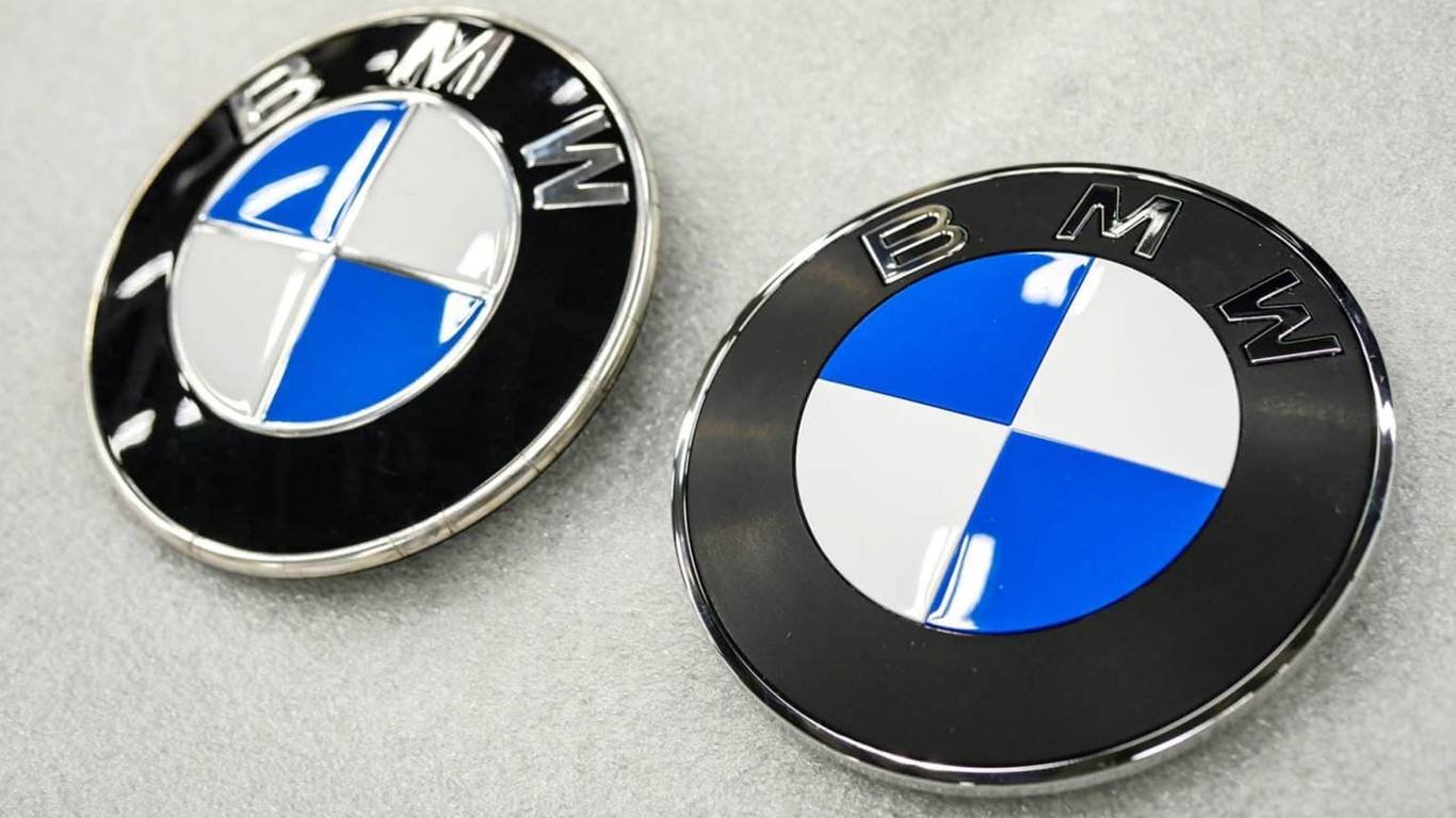
Less Flash, More Precision: The Fresh Look of the New BMW Emblem

-
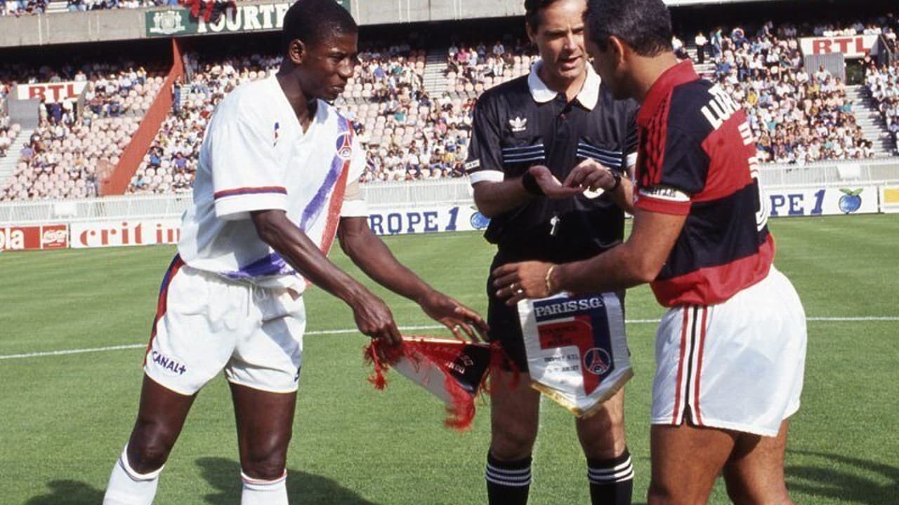
Flamengo and PSG have faced each other three times; check out their record
-

Indonesia Open Footgolf Tournament: Comedian Oki Rengga Admits Addiction, Wants to Become a Professional Athlete
-

Shameful Incident in Punjab! Landlord Rolls Tenant’s Daughter
-

Virgil van Dijk Expresses Desire for Mohamed Salah to Stay at Liverpool
Deixe um comentário